Loadsmart
A design made to disrupt truckload shipping
Loadsmart Website
A design made to disrupt truckload shipping
Introduction
Loadsmart is a technology company in the truck logistics business, a highly competitive and traditional market in the US. It was founded in 2014 in New York with a very ambitious proposal: become the best and most advanced freight broker through big data and a superior service model.
The Challenge
The first and biggest challenge was to design the face of a new service from scratch. No other company, at that point and acting as a broker, was able to provide an instant price for a shipment and commit to it. Besides that, truckload shipping always happened with the help of load boards and telephone calls. In order to escape the traditional model of service, we differentiated ourselves by presenting core features fast with an easy and intuitive experience.
The Challenge
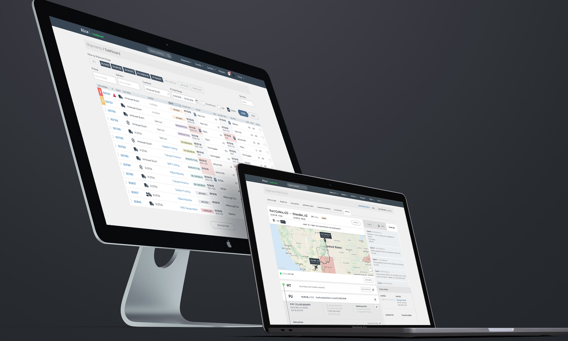
Alice is a set of tools that is used throughout all departments of the company, from sales to accounting. Each tool is seen as separate product that shares components and functionalities with others in the platform ecosystem. Designing solutions for the platform requires a holistic perspective of the functions and a special care with the design system.
With the sudden growth of Loadsmart, several products had to be scaled for larger operations while new and smarter solutions designed from scratch and added to the platform.
My Role
Working with Loadsmart as its single designer from its inception and now as its Director of Design, I am responsible for defining Loadsmart’s entire design strategy from start to finish. I led Loadstarts’ institutional strategy, from all customer facing products to internal pages and mobile apps. This work has included: conducting research, defining success metrics, leading projects, designing Loadsmart’s interfaces and specifying end-to-end interactions of all our products.
DEPTH OF THE PROBLEM
Loadsmart was founded by specialists in the financial market with some software engineers with a clear idea of turning the brokerage process, one of the most time consuming and painful, a data-driven and automated process. Although they had a good knowledge of the industry, none of us were specialists that could talk with proper experience in the field. Our sources for research were a handful of shippers and carriers with whom we started to develop a relationship or reports that we bought from other companies.
After talking to as many people as we could and benchmarking we started to establish the depth of the problem we were trying to solve. There was enough room to create something new that could make a real impact on how brokerage was done: providing an instantly bookable price for a shipment online. How would we guess a correct price? WIth data we could collect about the supply (carriers) and historical trends.
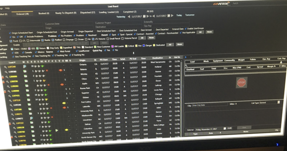
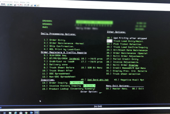
Logistics is a complex coordination of people, facilities and supplies. By 2014, when Loadsmart started, this industry was still based on systems coming from a non-digital world, with many parts of the process happening off the computer mainly over the phone, just like stock markets used to work in the 90s. Finding a truck could take hours and be very expensive.
DESIGN SYSTEM
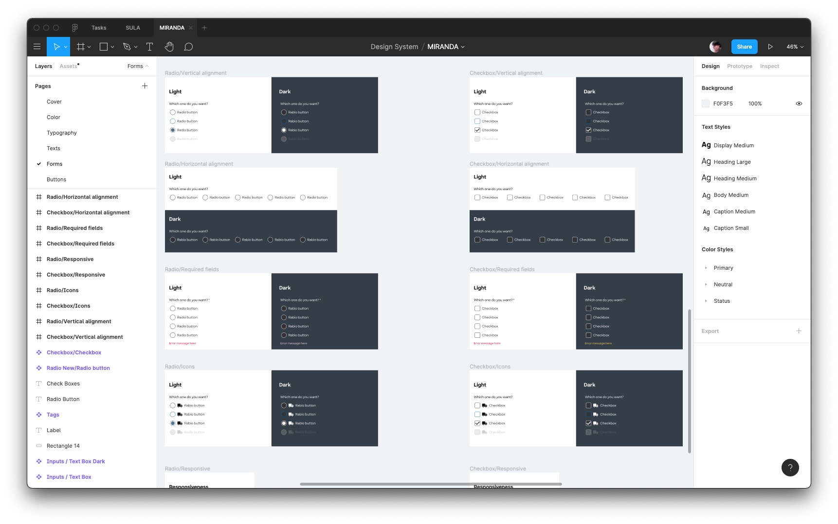
The design system is a foundation for any company starting with digital products, and Loadsmart had only a brand. Using references as Bootstrap and Google Material, we created a system based on atomic design that had basic components. This would allow us to prototype screens much faster with real elements (sometimes skipping the wireframe part) and facilitating the engineering with a single source of truth.
Loadsmart today has 2 design systems: one for internal products that are much more dense in information on screen, and another for customer-facing products that was based on our green color. The process of creating new components goes through a design critique meeting, testing with the development team and final documentation on Zeroheight.
LANDING PAGES
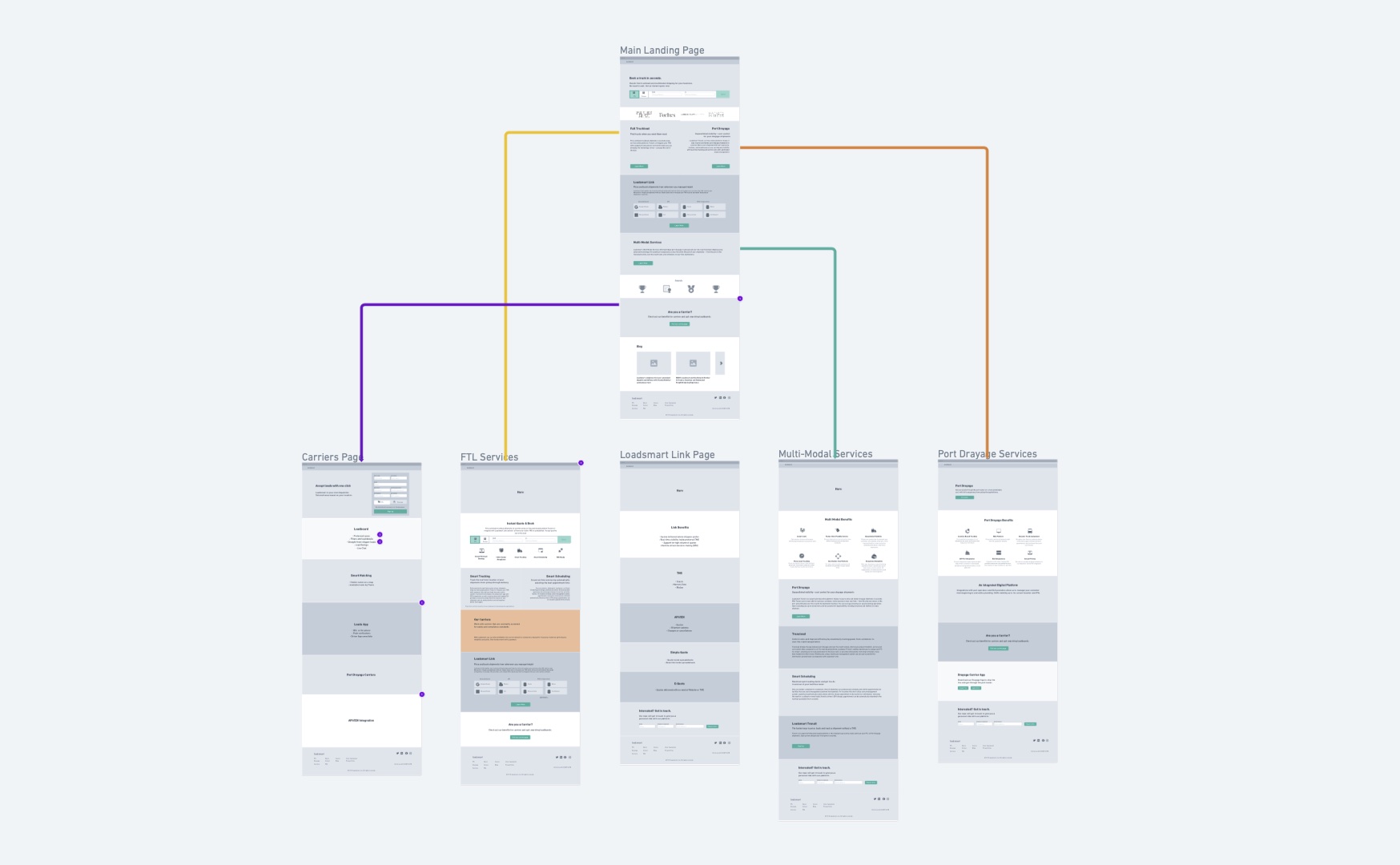
As a marketplace, Loadsmart has to show itself differently to shippers or carriers. On the shipper side, the user is presented with the possibility of quoting a shipment – Loadsmart's main feature – right at the top. On the carrier side, the user is invited to join by filling out a quick form.
QUOTE & BOOK
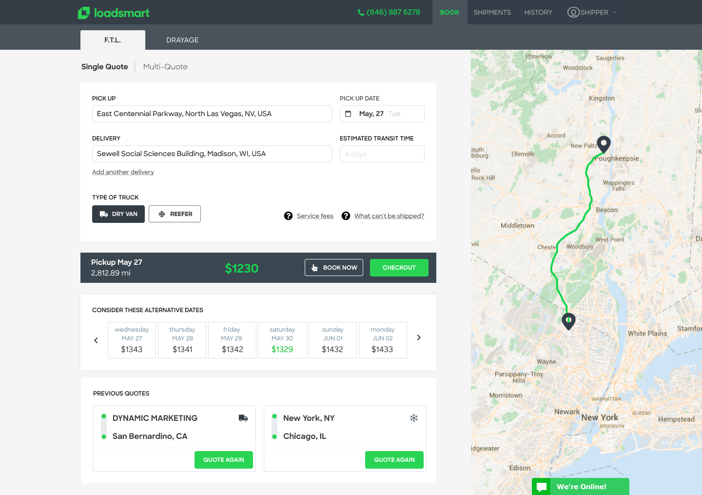
Being the most important feature of the platform in the begining of the company, users are able to quote and book a load by simply providing 2 addresses. The date and type of truck would be pre-selected for a quick quote. To make the checkout faster, Loadsmart has a flow different from the traditional – information first, payment later – and process the payment before the user confirms origin and destination details.
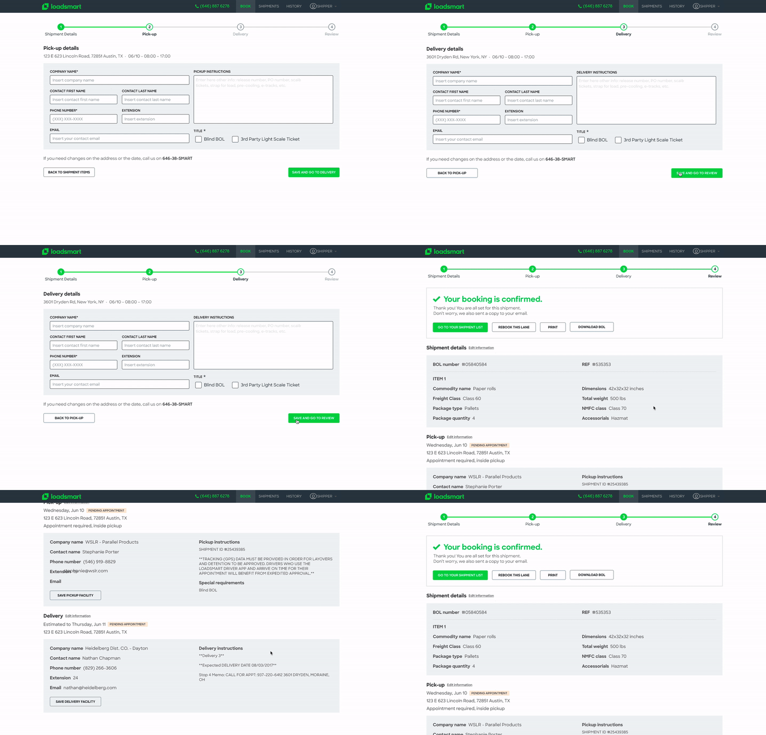
The confirmation happens with a 3-step wizard to remove complexity and information overload about the specific details of the load.
Users are required to provide the exaxt pickup and delivery location and contact person only after payment, or they can select a preferred facility from a previous order.
Capturing the correct information is essential for the operations team to be able to start working on the sourcing as fast as possible, therefore the UI plays an important role in the process.
SHIPMENTS LIST
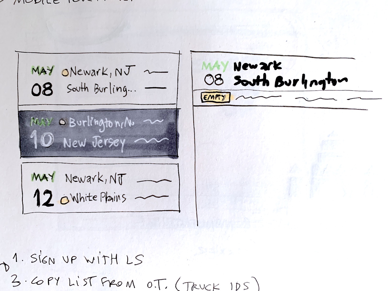
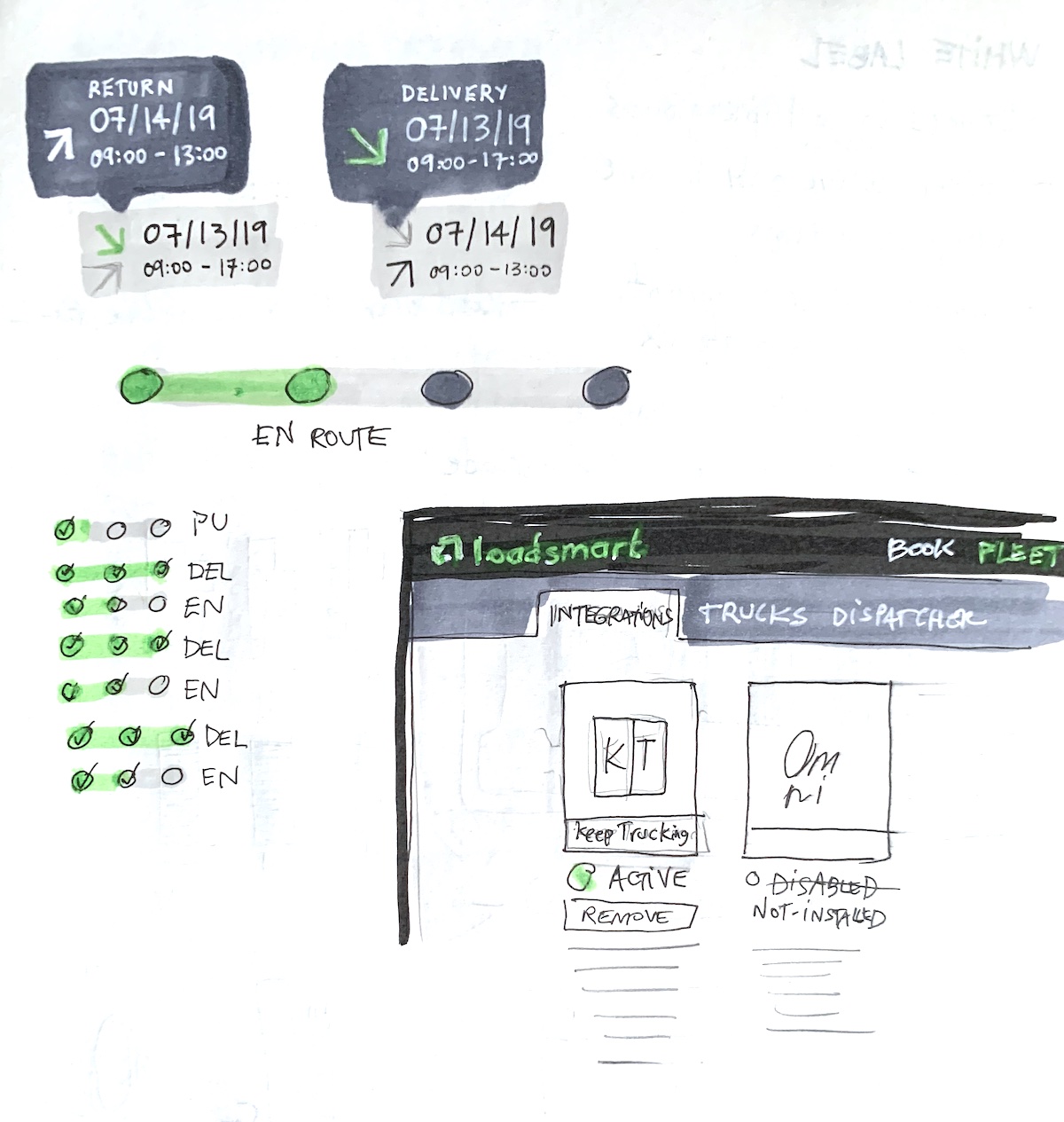
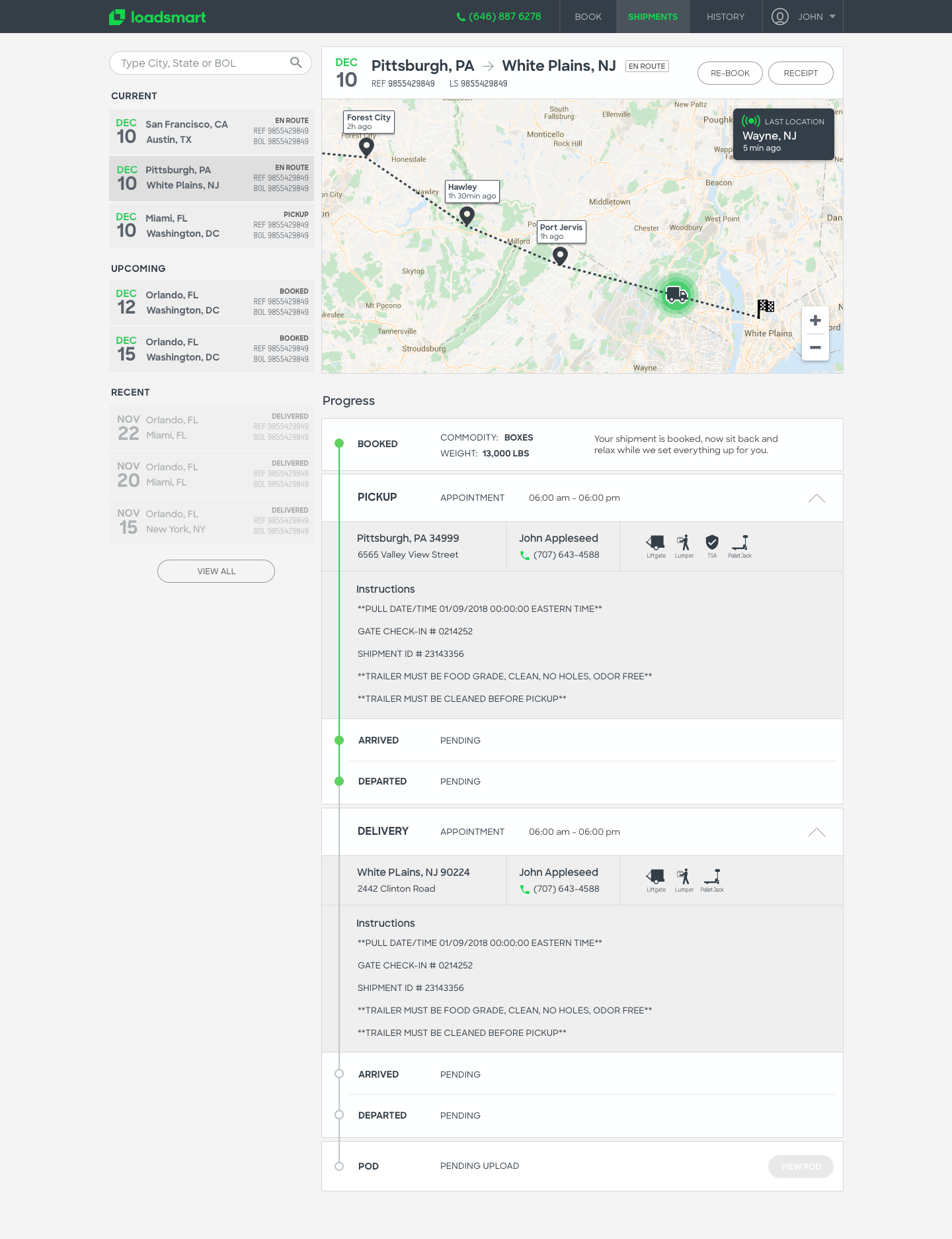
Once logged in, shippers and carriers have a page listing all the upcoming and archived shipments. Sketches were made to present the shipment timeline and a map with the truck trajectory. The menu on the left shows current, upcoming and the most recent completed shipments.
Several studies were made on paper before wireframes, and used to validate concepts with our specialists. After a few interviews we realized that most users just needed to check the status and see if everything was going as planned. We wanted to provide the most important information necessary to follow up with a shipment without overloading the screen.
LIVE LOADS
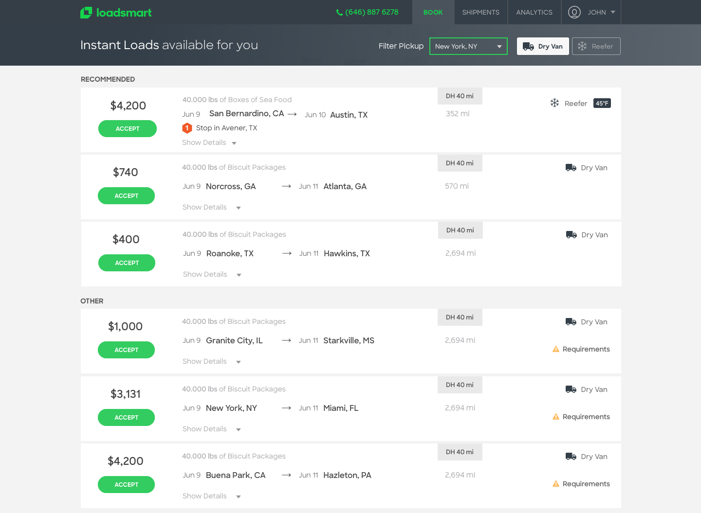
Carriers have a specific page to browse and accept available loads. Each load is presented in a card-style list that is expandable to show more details. On the top, a search field allows users to sort loads by proximity to a specific city or state; and buttons to filter dry van or reefer loads, variables which may determine selection of a load.
Why is this unique?
Bringing design to a traditional industry is a huge achievement for the field. Since 2014, Loadsmart has grown its design team from 1 to 12 professionals and the work of individual contribution has become a highly streamlined system of coordination and strategy. The experience design has become increasingly data-driven and is present today in every product squad.
In 2017 we were awarded with a prize for interaction design at the DOGA Merket in Oslo. Loadsmart's innovation is recognized by the logistics industry in the US for its cutting-edge design as a component of its success.
Takeaways
Designing the entire consumer-side of this service was one of the greatest experiences I had. Screen recordings and behavioral observations were useful to refute or confirm assumptions, making decisions a lot easier to take. Several designers, back- and front-end developers were involved in each product, which gave me the opportunity to work with several groups of people and have my ideas constantly challenged.
The partnership with Eggs Design has proven to be a great move, which awarded us with a prize for interaction design at the DOGA Merket in 2017. Today, Loadsmart is recognized by its design edge and considers it to be one of the core components of the company.
Other Projects
🔓 AliceThe technology behind a freight logistics service
Loadsmart MobileNative app designs for iOS and Android
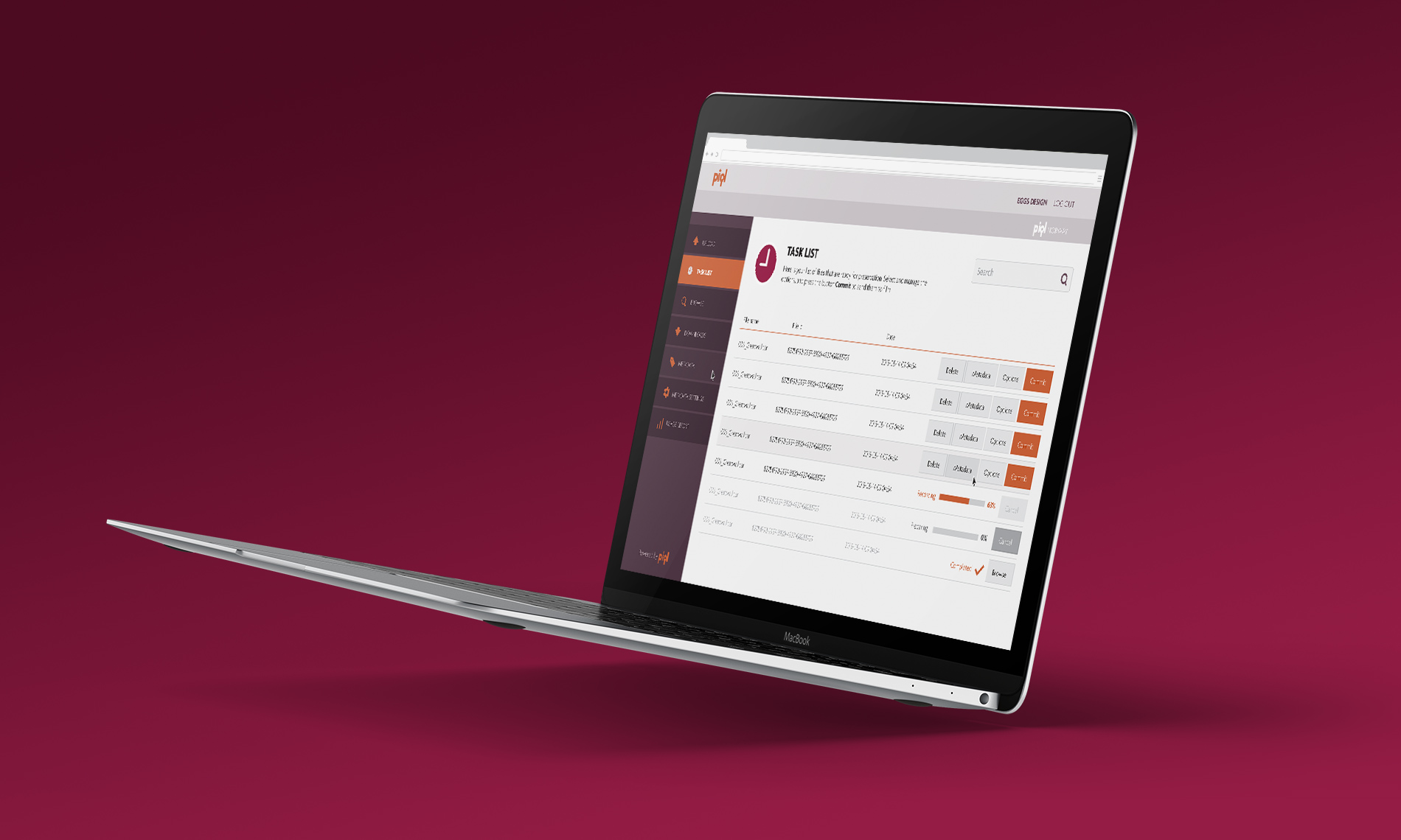
🔓 PiqlPhysical preservation of digital files
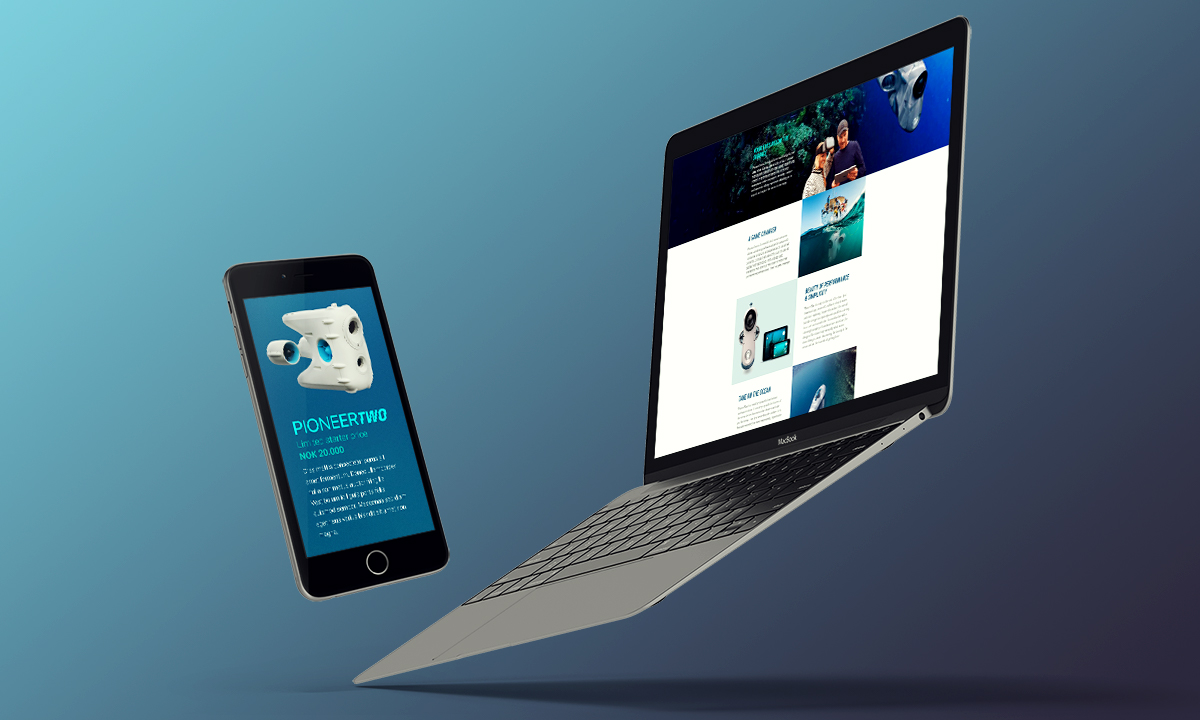
BlueyeThe first consumer underwater drone
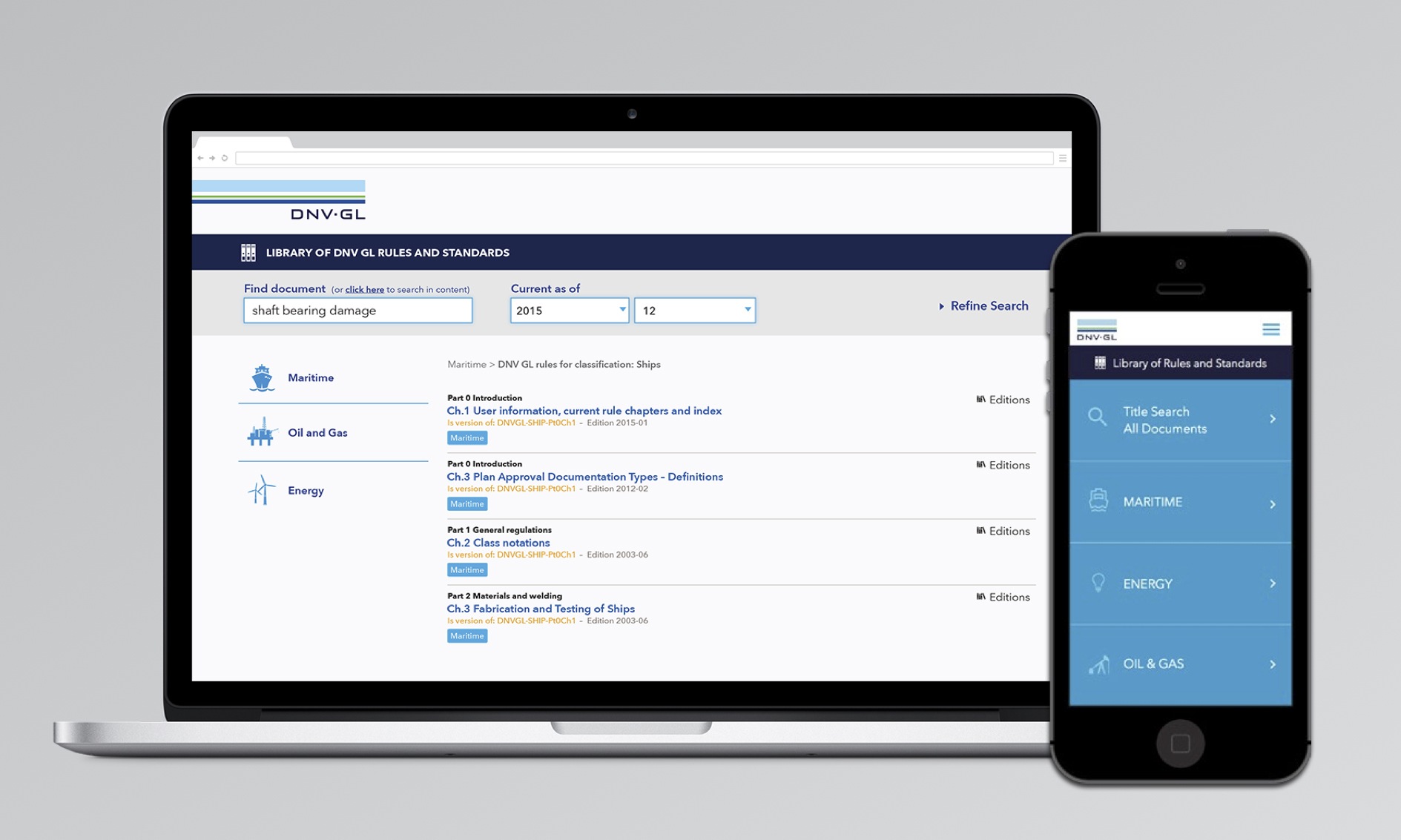
DNV-GLAn oracle of maritime standards
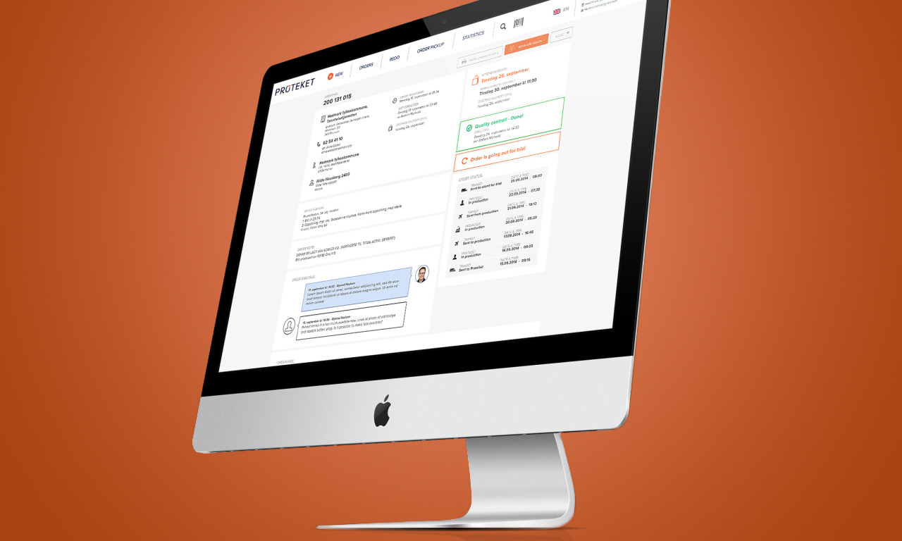
ProteketShop experience for teeth prosthesis
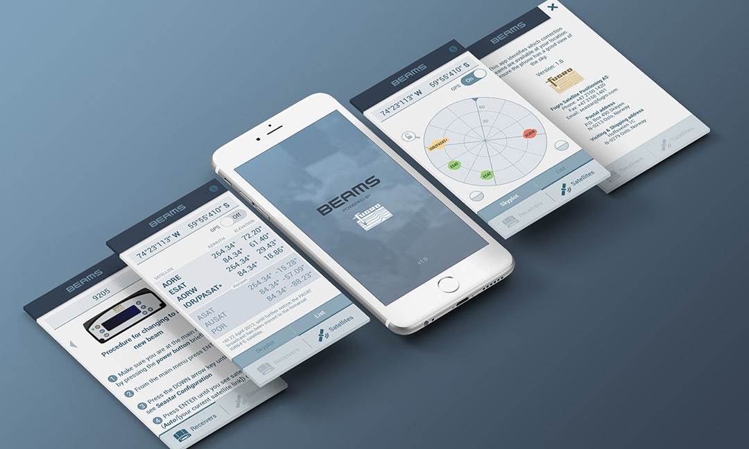
FugroA constellation of satellites on your phone

🔓 _nessCustomized branding of an internal UI

Piezo ShowerA self-heating shower

🔓 AppconThe conference of new technologies
© 2018 VICTOR STELMASUK. ALL RIGHTS RESERVED.


