Loadsmart Mobile
Three apps. Two platforms. One family.
Introduction
Loadsmart is a technology company in the truck logistics business, a highly competitive and traditional market in the US. It was founded in 2014 in New York with a very ambitious proposal: become the best and most advanced freight broker through big data and a superior service model.
The Challenge
In order to offer optimal service for its customers, Loadsmart wanted to distribute a set of mobile apps, for iOS and Android, for carriers and drivers. A third app was built for employees, but following the same design of the other two.
The products had to be available for as many users as possible, so the interfaces had to account for small or big screens, accommodate different languages, and be intuitive and visually appealing. Above all, the experience had to be as simple as possible since the information transmitted is of extreme importance to the smooth flow of internal operations.
The Challenge
Alice is a set of tools that is used throughout all departments of the company, from sales to accounting. Each tool is seen as separate product that shares components and functionalities with others in the platform ecosystem. Designing solutions for the platform requires a holistic perspective of the functions and a special care with the design system.
With the sudden growth of Loadsmart, several products had to be scaled for larger operations while new and smarter solutions designed from scratch and added to the platform.
My Role
To accomplish this, I led the creation of platforms managing user flow and experience as well as designing all interfaces for both Apple and Google platforms to deliver assets and define specs of usage. The apps had to follow the guidelines defined for the responsive web version of the same products, while fitting naturally into the environment of each mobile brand.
I worked closely with Loadsmart’s mobile team in order to comply with best practices and required conditions, and to put the apps in both Google and Apple stores.
DRIVERS
The Driver App serves as a personal schedule and tracking device that drivers are required to use throughout the shipment process. The app is capable of capturing the truck's location via GPS and, through geofencing, notify all stakeholders when the driver has arrived at the pickup or delivery destinations. As a fallback for low connectivity areas, the driver can manually set the status by tapping the check in/out buttons and record the exact time of arrival.
Assigned shipments appear automatically on the driver's dashboard, which they can use to navigate their routes and check details of the shipment. Upon completion of a trip, the user is able to upload relevant documents by snapping a photo and pressing the upload button. The documents are tagged, sorted and remain attached to each underlying shipment.
LOADS
The Loads App is used by carriers and drivers to browse available loads. As soon as a new booking is made on the system, the jobs are automatically sent to the best carriers for that job and appear on the app as recommendations. With a few taps, they are able to check the details of respective carriers and accept jobs.
Filters on the top allow users to sort jobs by proximity to their location and load type – reefer or dry van. The acceptance process simply requires a driver name and telephone, and the accepted job will appear under the 'My Loads' tab. Carriers can also change their preferred regions of operations under the 'Settings' tab.
JARVIS
Jarvis is a light version of the internal system used by operations to keep track of ongoing shipments. Available only for employees, this app lists all the ongoing shipments and allows representatives to follow the progress of their client's loads wherever they are.
The app was built in a record time of 2 weeks, hence the predominant use of Apple's design toolkit. Only the splash screen and minor details were changed to make the design fit into the Loadsmart app family.
DRAYAGE
The latest addition to the app family is Drayage: a mix of Driver App and Loads App in one, specially made for carriers who work transporting containers in and out of the port. To deliver this app in production as fast as possible, I adapted components from the sibling apps while testing for 4 main scenarios of drivers: full or empty container, going to or out of the port.
The team simulated the whole journey with prototypes, from the first access to accepting and driving a load. After everything was validated, the developers stepped in and the app was available for download within 4 months for both Android and iOS.
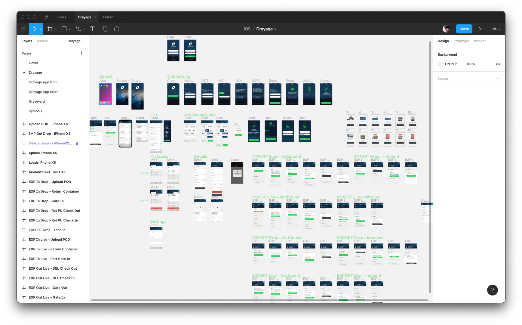
Drayage is a mode of transportation that requires much more information from the carrier. In order to make this step easier for first users, the app onboards them with a wizard to capture all required details. Upon successful onboarding, the user receives a magic link that logs them in automatically.
Once inside, users can browse and book loads using a side panel to filter containers or chassis that match their fleet. If a load is selected, they are asked to confirm the equipment for easier port entry.
Another tab displays their accepted loads, which they can navigate to see the address or switch to a driving mode that will allow them to check in and out of facilities.
Takeaways
Starting all products from scratch required the mobile and design teams to work closely together for several months. Drivers are users that are spread across the country in remote locations, and constantly busy doing their job or resting. This made research specially difficult to perform, but the success of the product made shipments incredibly easier to follow.
When dealing with valuable assets it may take some time until operations rely 100% on mobile data, but this is an essential step for a scalable service. In this case, redundancies like button tapping and geofencing were extremelly important to reduce uncertainty. Battery usage was also a factor to take in consideration, since we depended on mobiles to be on and tracked in shipments that could last sometimes 2 or 3 days. Removing unnecessary features was key to make consumption as little as possible.
Other Projects
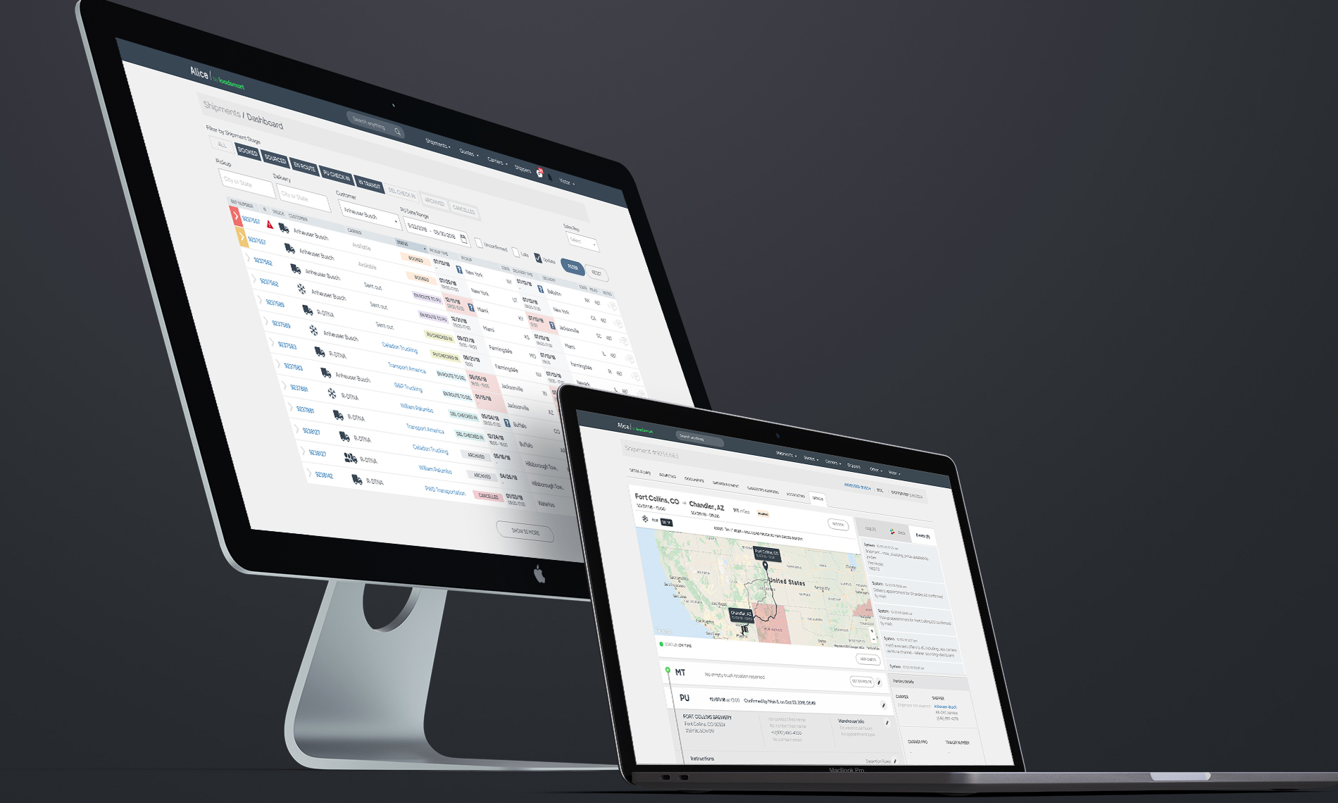
🔓 AliceThe technology behind a freight logistics service
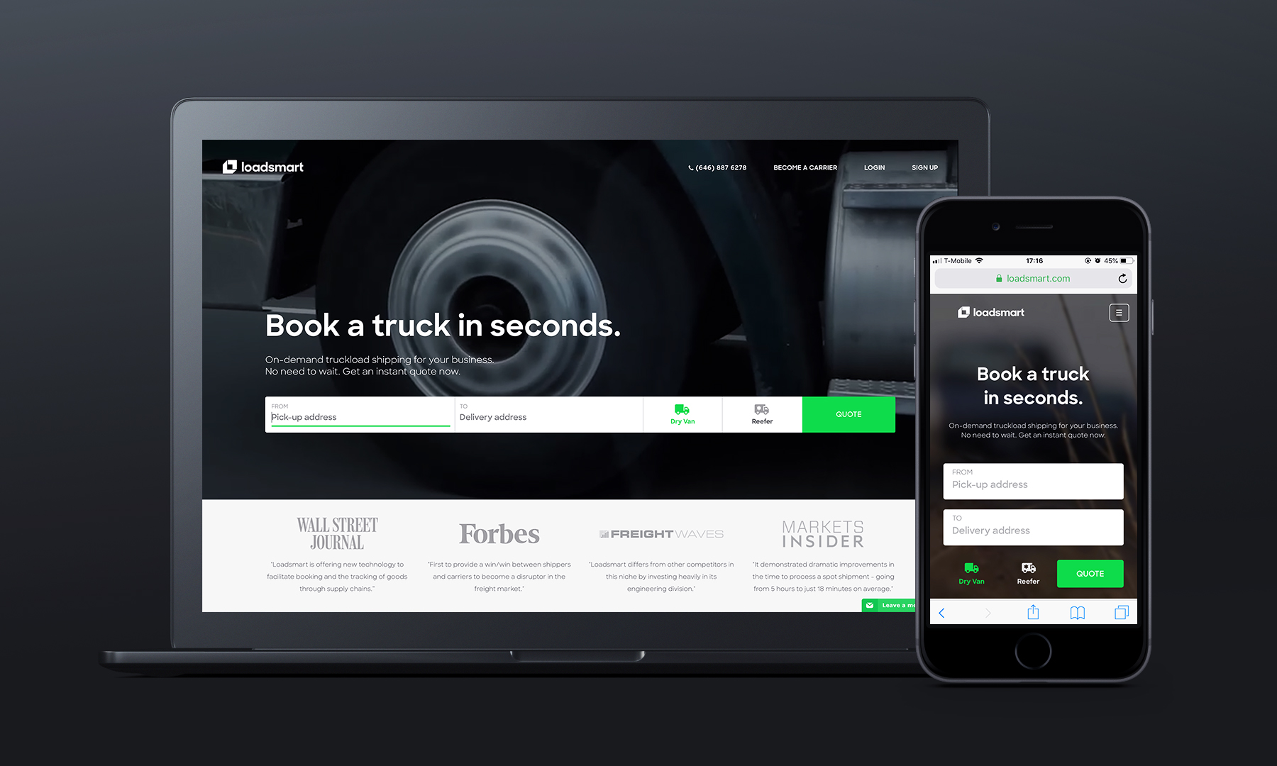
LoadsmartA design made to disrupt truckload shipping
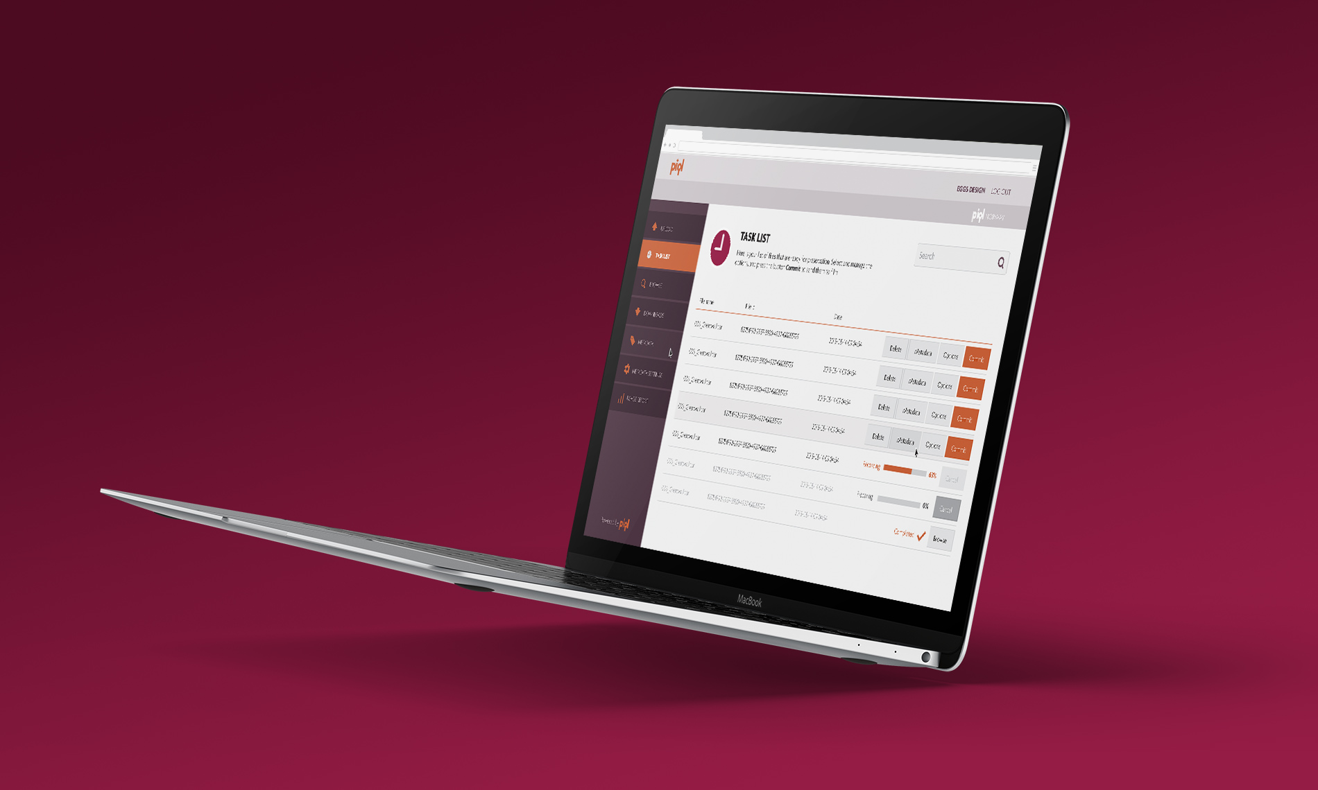
🔓 PiqlPhysical preservation of digital files
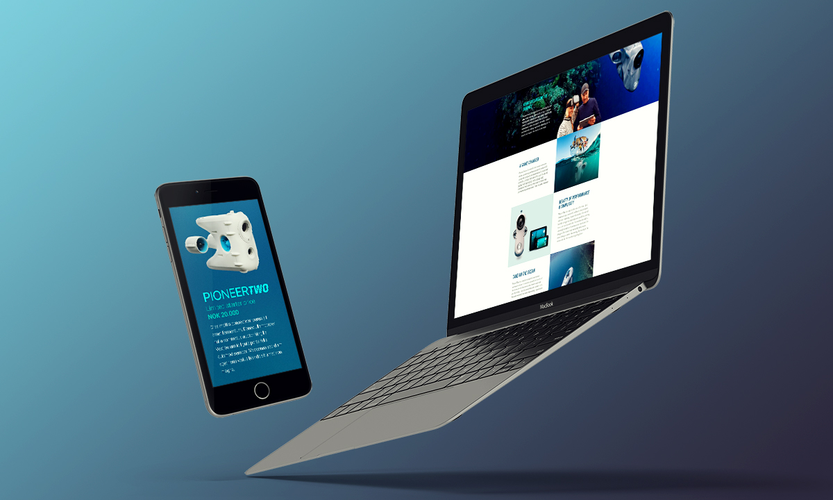
BlueyeThe first consumer underwater drone
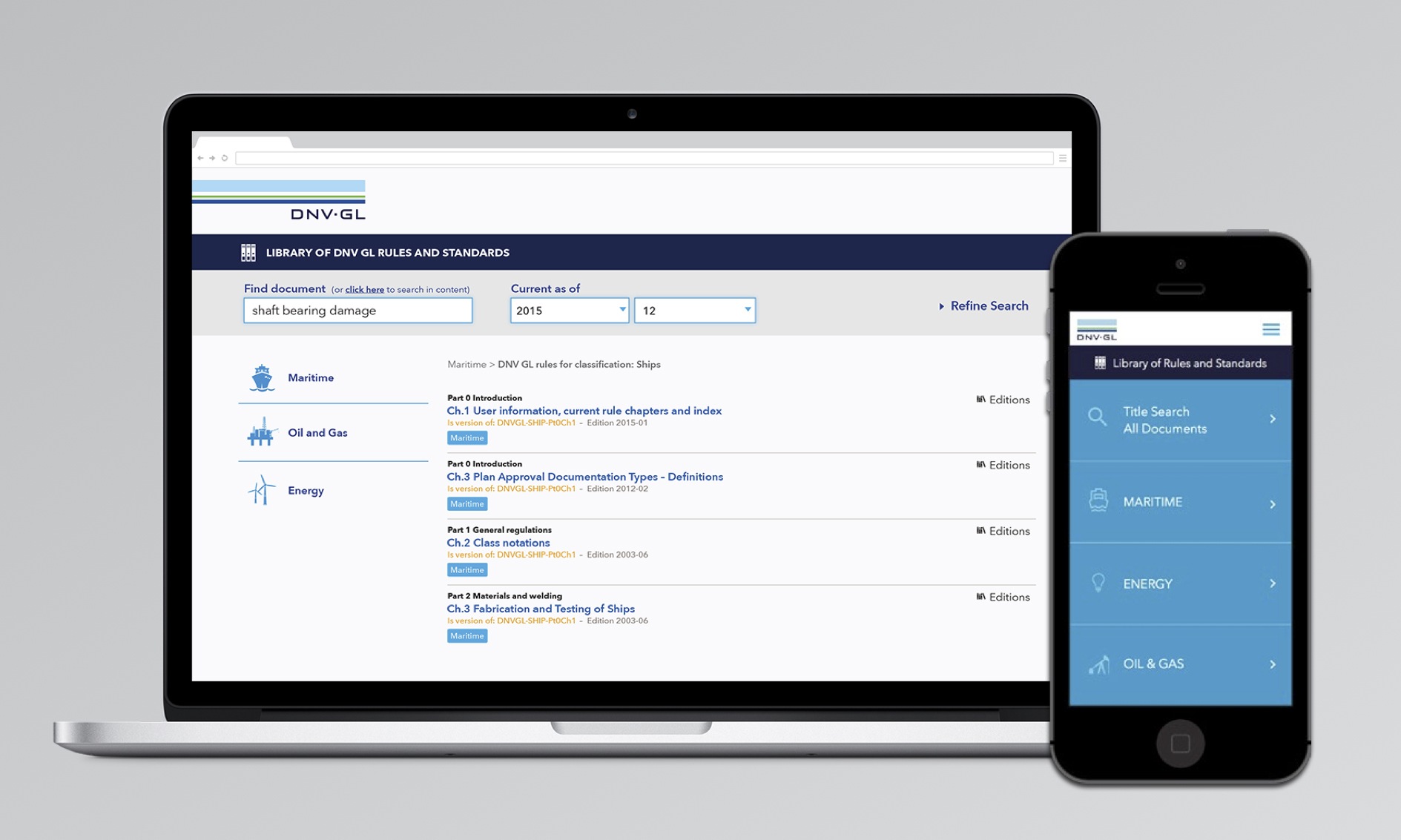
DNV-GLAn oracle of maritime standards
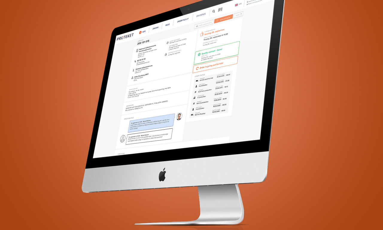
ProteketShop experience for teeth prosthesis
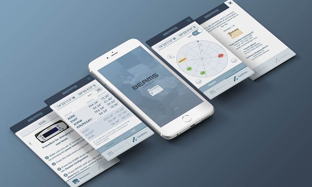
FugroA constellation of satellites on your phone
🔓 _nessCustomized branding of an internal UI

Piezo ShowerA self-heating shower

🔓 AppconThe conference of new technologies
© 2018 VICTOR STELMASUK. ALL RIGHTS RESERVED.